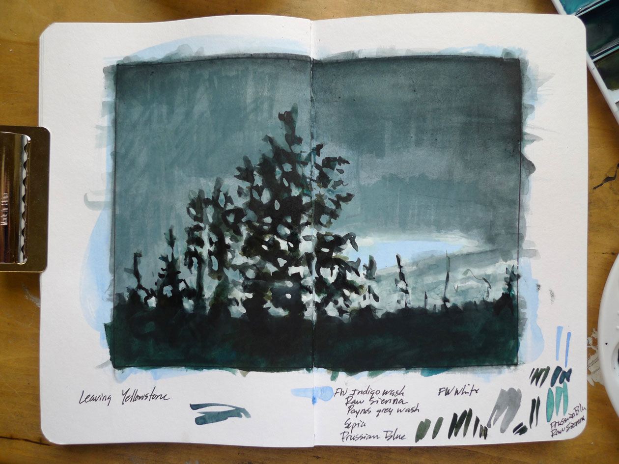
Intrigued with some of the elements of my previous study, I decide to continue working with images of the sky and atmosphere. I reviewed my photos from my most recent trip to Yellowstone National Park, and was immediately drawn to this image of a passing storm taken on our last morning in the park.

I’m working within a 6″ by 8″ format for a variety of reasons. One of them being that I want a border around the image for notations and testing of colors – this is, after all, an experiment. Also, I have a bunch of 30″ by 40″ canvases which are already built – the 6″ by 8″ format corresponds to the format of these canvases – familiarizing myself with the basic spacial relationships if I end up wanting to translate one of these studies in oil paint on canvas.

One of the best things about these FW inks is the eyedropper cap of the bottles, allowing a measured application of media to the palette. I use only a couple of drops of ink, and then dilute with water, to create the wash.

Similar to the “glazing” and “scumbling” techniques of oil painting, I continue to apply wash layers of color to darken areas, and use the opacity of the pure white to define the lighter areas.

Once the basics are in place, I expand my color palette, which now includes: Indigo, Paynes Grey, Raw Sienna, Sepia, Prussian Blue and White. I still add water to the pure inks, but not as much, allowing the color to retain most of its intensity and saturation. I use separate palettes for the washes, saturated colors, and white. The opacity of the white allows me to begin defining the figure by painting the ground (defining the trees by painting the sky). To tone down some of the brightness of the white areas, I use the washes – controlling value by the layering of pigment rather than the direct mixing of pigment into the white.