Studies and Recognizing Early Influences

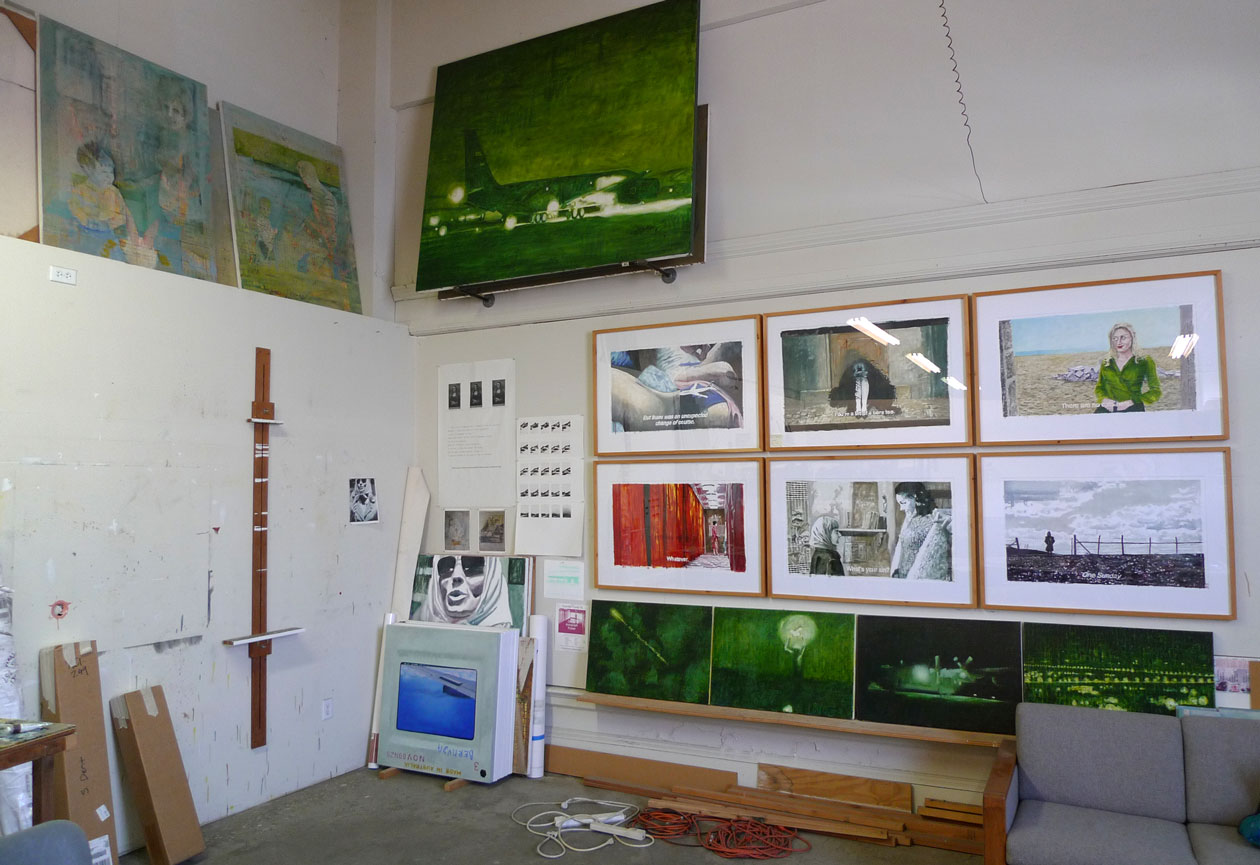
Being on sabbatical and having the time to actually contemplate my own work, I can see the influence of some of my earliest artistic heroes and how their presence has never quite left me.

sky_study_oil_01

There’s this great story of Robert Motherwell and the creation of his Lyric Suite. During the summer of 1965 Motherwell was experiencing a creative block. He had 1000 sheets of Japanese mulberry rice paper, which he had previously purchased on a whim. In an effort to work through his block, he decided to lay out the papers on the floor of his studio and to work on them in succession using only a brush and ink. An exercise in psychic automatism.

I had a real painting block, I simply couldn’t paint…somehow the old definition of Surrealism came back to me – to work without “a priori” judgement. And I thought why not just make a stack of things – make it as a rule of the game that I don’t judge them, change them, I just go on and on and on…I arrived at 565 and I had broke through…

– Robert Motherwell

I have repeatedly employed a similar technique in my own practice. Trying to let go of expectations and play – experimenting rather than thinking – engaging with the materials and process to see what happens. Sometimes the rewards are immediate, and sometimes they need time to soak in and cannot be recognized until years later.

These two studies in oil are the result of embracing that type of practice, and will serve as a starting place for the series to come.

sky_study_oil_02

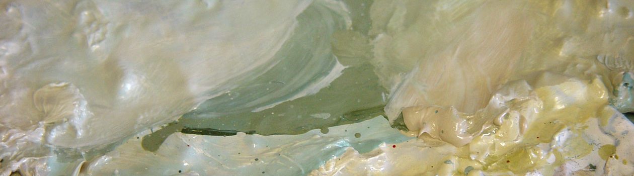
In looking at these atmospheric studies now, I also see the presence of the first painter that I consciously tried to copy, James McNeill Whistler. It was his Nocturnes which first seduced me with with their thin veils of layered color, soft edges, and beautiful subtlety. Still to this day I seek out examples of his work while traveling – partly because of his technique, partly because of their beauty, and partly because his work communicates so much more than just the physical appearance of things.

Grey Brush Pen Sets

Grey is so underrated. Brush pens are so intriguing. Packaged sets are so seductive. After my most recent trip to that most dangerous of places – the art supply store – I came home with these two sets of brush pens, each is an assortment of “greys”.

Faber-Castell PITT Artist Pen

FC_Pitt_brushset

Sakura Koi Coloring Brush Pen

Sakura_brushset

Both sets included six pens – three warm grey tones and three cool grey. Both brands produce quality products and are well respected. I have always had great luck with Faber-Castell PITT supplies, they are of a consistent solid quality. Sakura is a relatively newer brand to me, and I’ve only experimented with their brush pens recently.

Faber-Castell PITT Artist Pen

FC_Pitt_brush

The PITT set includes a nice variety, and a fairly even progression of values from light to dark. There is a consistency of temperature within the temperature families (cold or warm) which should allow for a cohesiveness when employing the full range of the subset – ideal for more technical or analytical rendering. I would say that these are more of a felt tip pen rather than a brush pen. But, the tip does allow for some line variety. They are also permanent, so when combined or layered over with water soluble media the marks will be retained on the page.

Sakura Koi Coloring Brush Pen

sakura_brush

The Sakura Koi pens definitely feel more like a brush. The pen lays down a wetter mark, and even though the tip is also made of felt it feels softer with more give. The greater width variety of the Sakura tip also allows for greater and more extreme line variety than the PITT. The color variety of the Sakura “greys”, while originally surprising, could lend itself nicely towards more creative, less analytical, renderings of subject matter. If you plan to use these with water based media, don’t get too attached to your marks, as the ink the Sakura pen is water soluble.

compare_uncapped

My initial reaction to both of these sets is that I’m glad I bought them. What at first appear to be very similar products, these sets have totally different attributes which lend themselves to completely different creative applications. As I continue to play with these, I’ll post my findings.

In the meantime, here are some links for a greater appreciation of the variety of brush pens on the market and examples of their many uses.

Resource:

Jetpens guide to brush pens for calligraphy

Jetpens guide to brush pens for comics

Jetpens guide to brush pens for art


Looking at what I’ve done

Sitting, looking, reflecting, remembering, critiquing, cringing, smiling and discovering the previous work in my studio is a place to start.

studio

Taking stock.

  • What works? What doesn’t?
  • Form and Content. Paint and idea.
  • Which ideas still intrigue me? Which ideas have become stale?
  • Am I still there, or have I moved on?
  • Why did I leave that one unfinished?
  • What have I gotten out of making all of these things?
  • How did I feel while working on these?
  • Where was I just “going through the motions”? Where was I “stretched”?
  • Where was I following a formula? Where did I take risks?
  • Where was I open to the unexpected? Where was I controlled? And, which do I now appreciate more?

The space of time – looking back – allows for a slightly more detached position where my perspective begins to shift and I can begin to look at these same things differently, in hopes that new ideas may sprout and grow.